Université de Toulouse
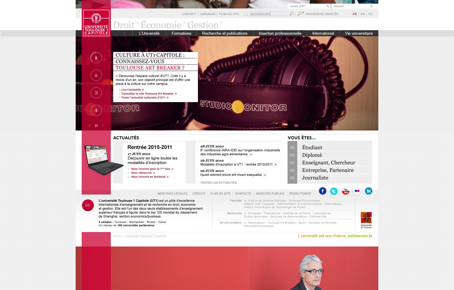
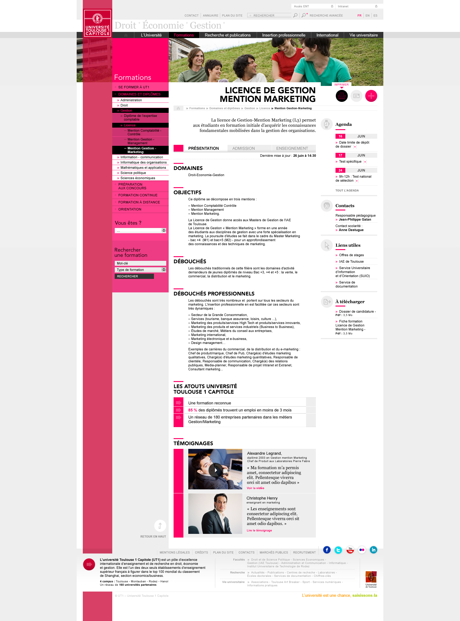
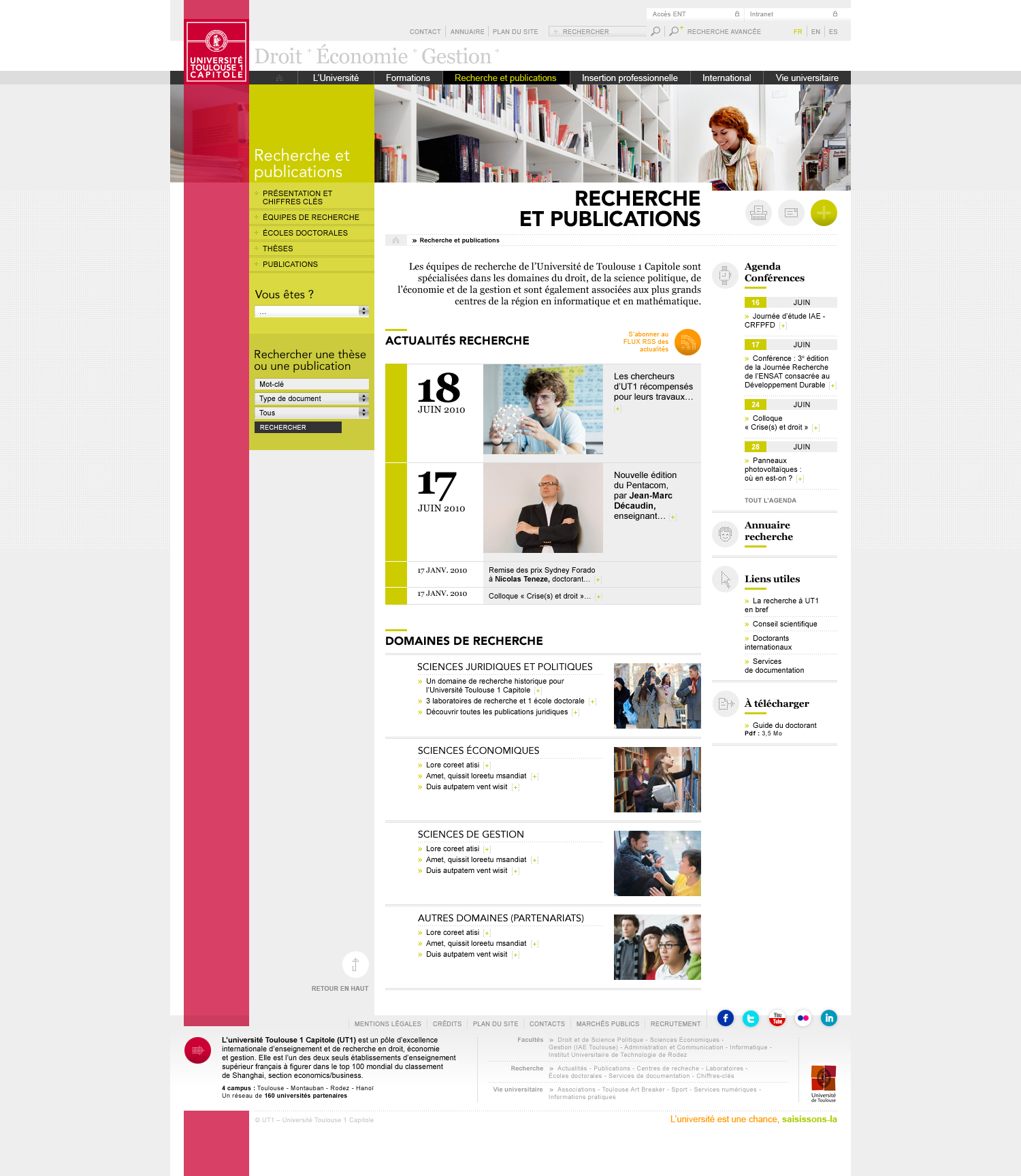
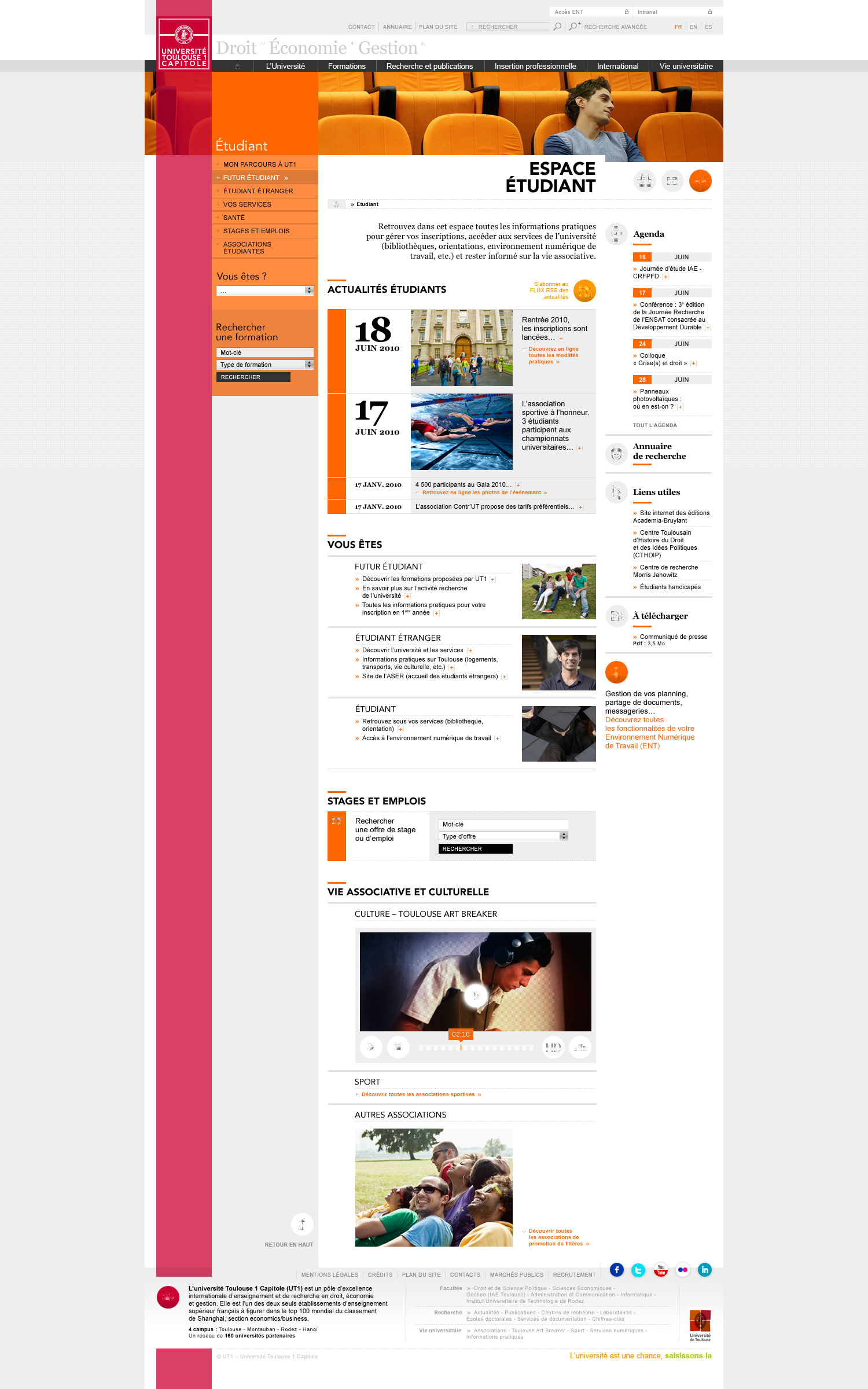
The University of Toulouse (UT1 Capitole) started to redesign its website in late 2010. The new layout by L’Éclaireur is a modern, vibrant, slick rearrangement of the existing editorial tree.
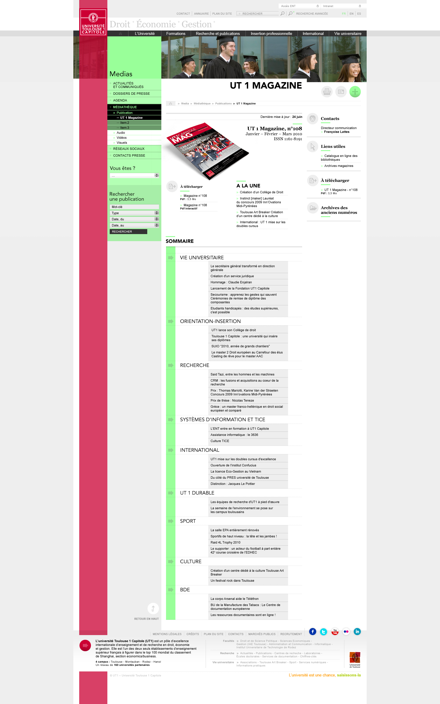
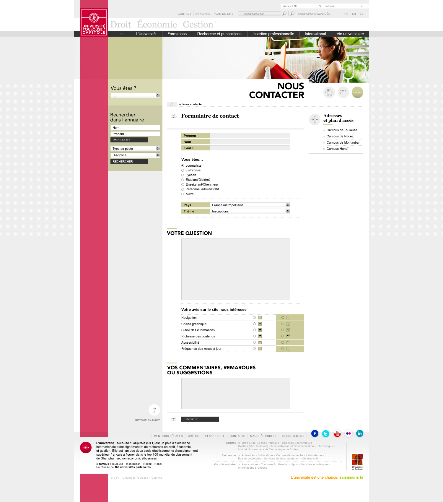
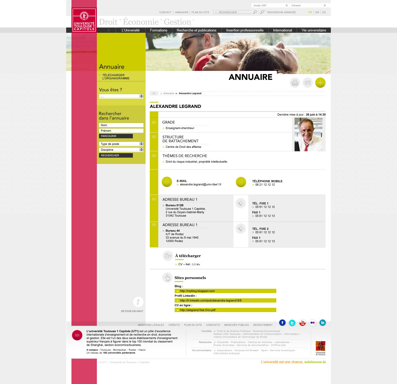
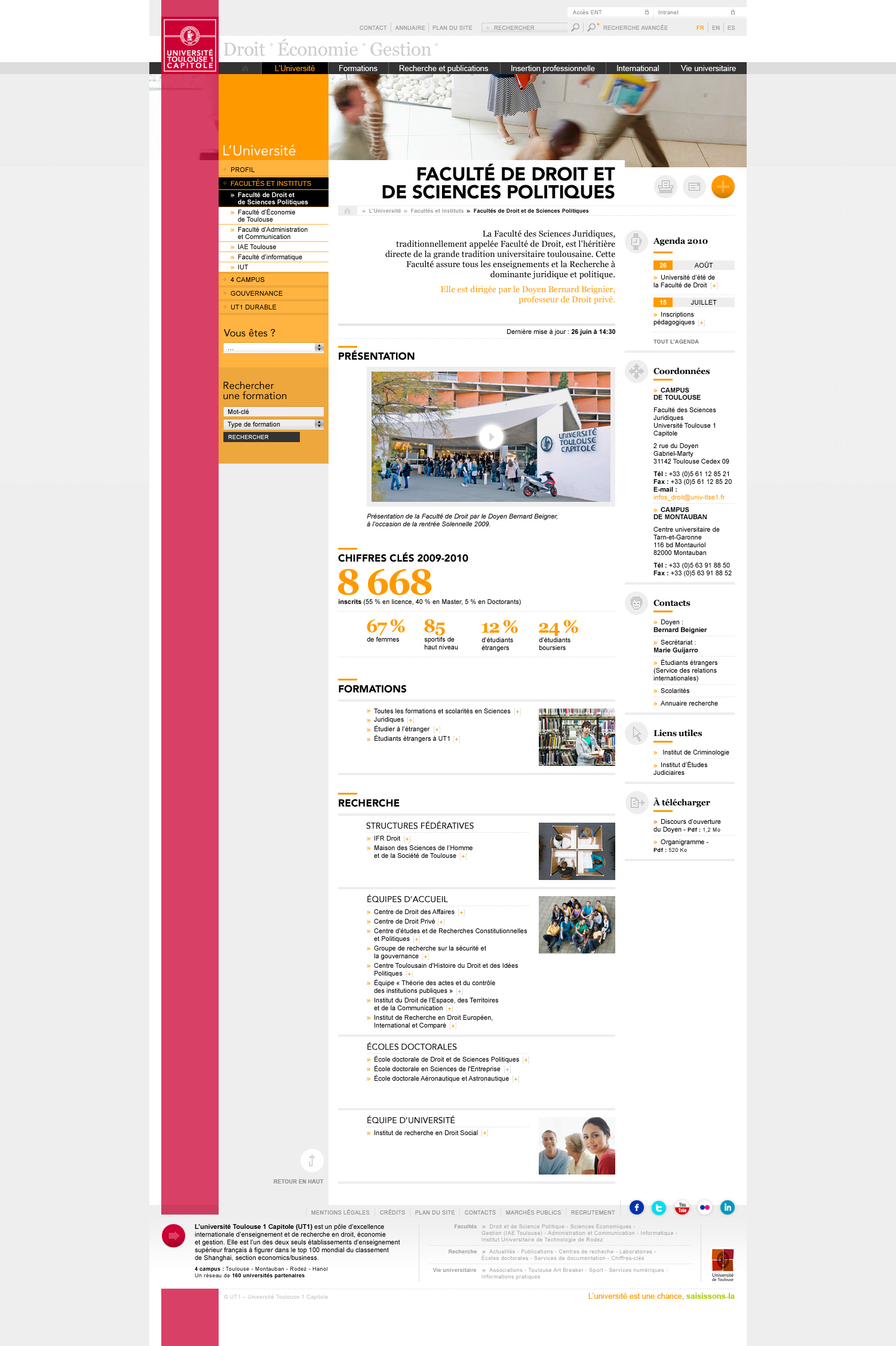
19 complex templates have been sliced, cut, then mixed into the proprietary CMS to build the new pages. Every UI element exists in 6 groups of 4 colors, identified with specific CSS classnames. The homepage has a nice automatic parallax-like running in the background.
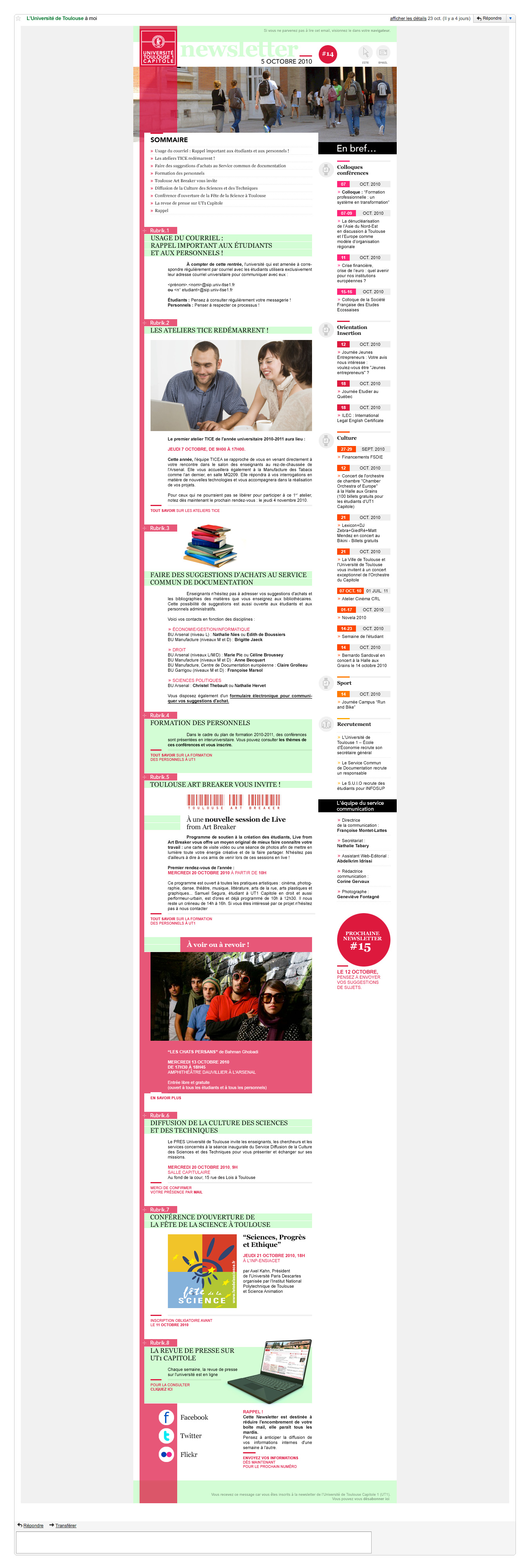
The tallest e-mail template I’ve ever seen (3994px !) was also delivered.
The new version was launched a few weeks before university term in 2012.
© 2008-2017 ITALIC™ • 8 bis rue Abel • 75012 PARIS • Tel +33 (0)1 48 44 46 35 • RCS PARIS 508 228 772 • Powered by WordPress & GoodLayers

